

Reports Overview
Cortado’s Reporting section gives you a clear picture of how your business is performing — from close rates and revenue to sales tax totals and daily team activity. Reporting is organized into three pages under the Reporting section in the sidebar.Overview
Close rate, leads count, and daily activity
Revenue
Revenue Intelligence Dashboard with KPIs, trends, and funnels
Sales Tax
Tax collected, broken down by rate
Overview
The Overview page (Reports) is your at-a-glance performance snapshot. It contains two key cards and a daily activity summary.
Close Rate Card
Shows the percentage of leads that converted to bookings in the selected period.- The large number is your close rate percentage
- Beneath it, you see how many leads converted out of the total
- A change indicator shows how the current period compares to a previous period
Leads Count Card
Shows the total number of inquiries received in the selected period, with a breakdown by stage (New, In Progress, Quote Sent, Accepted, Rejected, Stale).- Each stage is displayed with a count and a proportional bar
- The change indicator compares the period total to your chosen comparison period
Date Range Filtering
Both the Close Rate and Leads Count cards support flexible date ranges. Use the selector in the top-right of each card to choose:- Preset periods — Today, This Week, This Month, This Quarter, This Year, and more
- Custom — pick your own start and end dates
Comparison Periods
Click the “vs” label on either card to open the comparison settings. You can compare the current period against:- Previous Period — the immediately preceding period of the same length
- Last Month
- Same Period Last Year
- Custom — any date range you choose
Daily Activity Summary
Below the two cards, the Daily Activity Summary shows the notes created and tasks completed on a specific day, across your organization.- Defaults to yesterday so you can review what happened the day before
- Use the date picker to look at any past day
- See counts for notes created and tasks completed at the top
- Each note and task shows the linked item (inquiry, event, booking, contact, invoice, or quote) so you can jump straight to the relevant record
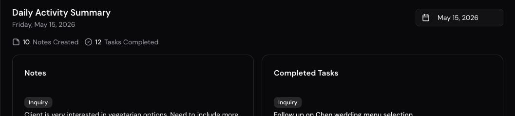
The activity summary helps managers stay on top of what their team accomplished and where attention went each day.
Revenue
The Revenue page (Revenue) is Cortado’s Revenue Intelligence Dashboard. It combines multiple lenses on your financial performance into a single view.
Period Selector
At the top of the page, switch between preset periods (This Month, This Quarter, This Year, etc.) to refresh every metric on the page simultaneously.Revenue KPIs
Five key metrics are displayed at the top:- Collected — money that actually landed in the period: successful card and ACH payments plus recorded cash or check, including installment payments. Collected is dated when the payment succeeded, not when the invoice was created — so a January invoice paid in March counts in March. Refunds reduce Collected in the month of the original payment.
- Outstanding — revenue awaiting payment on invoices created in the period
- Total Pipeline — the combined value of all invoices created in the period, with a count
- Avg Invoice — average invoice value
- Close Rate — percentage of leads that converted, with the converted-to-total count
Revenue Trend
A month-by-month bar chart shows Collected versus Invoiced revenue across the period. Hover any bar to see exact amounts for that month. Invoiced follows invoice created dates; Collected follows payment dates, so the two bars for a month will not always match — that’s expected when customers pay later.Revenue by Event Type
A ranked breakdown of revenue by event type. Each event type shows:- The label you configured for that type (including custom event types — not an internal code name)
- Total revenue for the period
- The number of events
- A proportional bar showing how much of total revenue came from that type
Lead Conversion Funnel
A visual funnel showing how leads progressed through your pipeline stages in the selected period. The close rate is highlighted at the top, followed by counts and proportional bars for New, In Progress, Quote Sent, Accepted, Declined, and Cancelled stages.Period Summary
A companion card summarizes the period with key totals: total leads, leads converted, invoices created, revenue collected, revenue outstanding, and a calculated collection rate when invoices exist.Sales Tax
The Sales Tax Report page makes reconciling invoiced tax straightforward for any period.Date Range
Choose from pre-made date ranges — This Month, Last Month, This Quarter, Last Quarter, This Year, Last Year — or pick a Custom range with start and end date pickers. The report uses each invoice’s invoice date, not the day it was created. It includes invoices that were sent or later. Drafts and cancelled invoices are excluded.Tax Summary
At the top, three cards summarize the period:- Taxable Sales — sales subject to tax, after discounts
- Tax Invoiced — tax you billed on those invoices — not cash collected
- Taxable Invoices — how many issued invoices in the period had taxable items
Amounts reflect what was invoiced, not what has been paid.
Breakdown by Rate
The Tax Breakdown by Rate table groups totals by tax rate. Each row shows:- Tax rate name
- The rate percentage
- Taxable sales at that rate
- Tax invoiced at that rate
- The number of invoices that applied this rate
If the period has no issued invoices with taxable items, you’ll see “No issued invoices with taxable items in this period” instead of a table.
Best Practices
- Start with Overview — check close rate and leads count each morning to see how the business is trending
- Use comparisons — always pair a metric with a comparison period; a number in isolation doesn’t tell you much
- Review the daily activity summary regularly — it’s a fast way to see what your team accomplished yesterday and which records had attention
- Check Revenue weekly — the monthly trend chart is most useful when you review it consistently, not just at quarter-end
- Export tax totals before filing — use the Sales Tax report to reconcile invoiced tax against your accounting system at the end of each reporting period
- Drill into event types — if one event type is underperforming on revenue, that’s a signal to revisit pricing or marketing for that category
Dashboard
See today’s activity and what needs attention.
Leads Pipeline
Manage the leads that feed into your close rate metrics.
Quotes
Send quotes — the first step toward revenue.
Notifications
Set up weekly summaries to get reports by email.
Gibby
Ask for the same report numbers when your role can view reports.